
Successful e-commerce customer acquisition relies heavily on this simple fact; the users should not abandon the path to conversion at any point due to any reason.
Once a prospective customer has reached your website or landing page through organic search or by clicking your ad, the next step, which will move the visitors down the conversion funnel, should be crystal clear and almost impulsive; clicking the call-to-action (CTA) button.
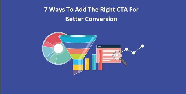
CTA is an essential element of a highly convincing landing page and an integral component of your marketing strategy that directs the users towards your intended purpose. A compelling CTA is often accompanied by relevant information that provokes potential customers to click through and also notifies them about what to expect once they click the button.
Following are a few tips to add the right CTA to optimize the conversion rate:
1. Use persuasive text
The textual description of your CTA should be on-point, clear and concise as you have only a limited number of characters to persuade the users to click on the button. If the words are complicated or too vague, the reader might lose interest.
The CTA button should also host strong command verbs that are influencing, provides guidance and most importantly, evoke enthusiasm and encouragement such as build, grow, discover, learn, join etc.
Humboldt County has a gorgeous website with arresting footage but what intrigues the visitors to continue the magical experience is the unconventional CTA button which features a bunny and a beguiling phrase “follow the magic”.

2. Give incentives
Providing compelling incentives to tempt the users to perform a task is one of oldest, and the most effective, tricks of marketing. The primary reason for the effectiveness of the marketing gimmick is that it benefits both parties; offers the users something worthwhile and provides you with a lead.
A CTA which features a potent combination of persuasive text and a valuable inducement for example “join now for the free trial” is bound to enjoy more clicks as opposed to a CTA simply stating “join now”.
Growth Robotics, a website for SEO audit, has an inviting CTA which highlights their generous offer to try their website auditing tool for a month, absolutely free of cost.

3. Add urgency
Fear of missing out, or more commonly known as FOMO, is an extremely useful motivator, especially for the current digitally inclined generation.
When you add an element of urgency to your CTA, such as limited time offer, until supplies last or offer valid for the first “X” number of customers, the visitors will not want to risk missing out on a great opportunity, influencing them to make a snap decision. However, your click-bait offer should be valuable enough to drive the users to act.
Peep Laja tested two variations of a landing page; one communicated urgency, with a countdown timer that signified the time left to avail the discount, and the number of bundles purchased while the other did not. Unsurprisingly, the version with the countdown timer and the “Bundle Bought” tab enjoyed three times more sales than the alternate version.

4.Optimize for mobile
It is imperative to customize your CTA according to different devices to make it the most prominent component on the screen regardless of the screen size.
The main reason behind carrying out mobile optimization is that mobile usability has seen an unprecedented rise in the past decade. According to research, mobile users are five times more likely to abandon a task if the website is not optimized for mobile. The same study also states that most mobile consumers are looking for fast results with more than 60% of the users looking to make the purchase the same day. Therefore, to stay relevant to the ever-changing consumer preferences, you need to jump on the bandwagon of mobile optimization.
Hubspot offers a highly interactive mobile user experience with an instantly noticeable CTA button. The following images show both the desktop and the mobile version of the marketing hub’s website.

5. Make it stand out
The CTA should be the most noticeable element of your web page. The content, cover photo and the website graphics, all play a critical role in grabbing the user’s attention. But if all other components overpower the CTA on the web page, the user will fail to notice the button instinctively and react appropriately, thereby sabotaging your desired purpose.
Therefore eliminate distractions and provide prominence to the CTA:
- Use contrasting colors to the surroundings
- Surround it with white space
- Apply complimentary borders
- Make it to the suitable size
Entreprenureonfire.com features a good example of a CTA button which follows the points mentioned above.

6.Have a logical placement
The placement of your CTA is another important factor that needs due consideration.
Conversion is a process which requires you to follow fixed steps to see results. The first phase is to warm up the prospective customer towards the idea of purchasing from you; the next stage allows the user to engage with your content while the final step- your CTA- provides the nudge towards conversion. Placing the button right in the user’s face may detract its power.
Therefore, place your button in line to the user’s viewing path and near to the previous action. It may sound simple, but many marketers overlook this cardinal rule.
Oli Gardner, co-founder of Unbounce, identifies the ideal placement for a CTA button in this case study, which works for most websites, and calls it the 5-point punch:

7.Test it
A/B testing is a great way to ensure that your CTA is garnering clicks. It also allows you to experiment and get creative when implementing a new CTA.
Once you have created a new CTA, you can check its effectiveness against the previous or control version to compare the results which can help you decide whether you need to stick to the old version or go ahead with the new variation.
Moreover, what works for someone else may backfire for you and what looks amazing on paper may fail on the digital platform, therefore always test different versions to obtain the maximum clicks.
Making a CTA button is not one of the hardest parts of your online marketing strategy but it yields a significant influence on your conversion rate. Therefore create an intelligently worded, highly notable, and well placed CTA for conversion optimization.


